COMPETITIONLINE —
ARCHITECT PLATFORM
Building a design system and redesigning the core search experience for a live product
A German platform for architects — tenders, news, rankings, and jobs. I joined as a part-time contractor and spent 2+ years working on the design system, redesigning key pages, and collaborating on new product features.

Overview
Competitionline is a platform used by architecture firms across Germany — the main destination for finding and tracking public tenders, staying up to date with industry news, and discovering job opportunities.
I joined as a part-time contractor (40 hrs/month) after a referral from a client I'd worked with previously. The team included a PM, a frontend developer, and a Strategic Product Designer named Kai who I collaborated with closely in the later stages. My work covered three areas: establishing a Figma-based design system, redesigning the tender search experience, and designing new collaboration features alongside Kai.
My Role
Part-time UX/UI contractor. I worked directly with the PM, frontend developer, and later with Kai (Strategic Product Designer) on feature design.
Built a Figma component library from scratch, aligned with the existing codebase
Redesigned the tender search page, tender detail page, and search profile flow
Designed responsive layouts across desktop, tablet, and mobile
Collaborated with Kai on new features: Labels and Comments
The challenge
Competitionline had an established product with a real user base — which meant two things: the UI needed to be modernized, but without disrupting how users already worked. Every change had to feel like an upgrade, not a rebuild.
No real design system to migrate from
The team had a few styles and components in Adobe XD — not enough to call it a system. My job was to build something that would support ongoing UI work, but it had to reflect what was actually in the product, not what I thought it should look like. When my initial color scales didn't match what was in the code, I had to reconcile the two — a lesson in what it actually means to build a design system for a live product.
Redesigning without breaking habits
The tender search was functionally established. Users knew the layout: filters on the left, results on the right. My goal wasn't to reinvent the structure — it was to apply the new design language, clarify information hierarchy, and add small UX improvements that made the experience noticeably better without making it unfamiliar.
A page that carries a lot of weight
The tender detail page is where architects make real decisions — whether to invest time and resources into applying. That context shaped how I approached the information architecture: dense data, but organized so the most critical details are visible immediately.
What I Did
Building the Design System
The starting point in Adobe XD was minimal — text styles, a few button variants, some icons. Rather than migrate, I built a new component library in Figma from the ground up, using what existed as a reference.
I followed an atomic approach: colors and typography first, then base components (buttons, inputs, dropdowns, checkboxes, chips), then composite components (modals, notifications, complex patterns). Where components didn't exist yet but I knew they'd be needed, I added them proactively.
My initial color palette followed a standard scale (25–900 gradation) — which looked correct in Figma but didn't match what was implemented in code. The frontend flagged the conflict, and I had to bring the system back in line with the existing codebase. That's when I understood that a design system isn't what lives in Figma — it's what's synchronized between Figma and code.

Component library built in Figma — aligned with the existing product codebase
Redesigning Tender Search
The existing search page worked — but it looked dated and had accumulated small UX friction over time. I redesigned it within the constraints of the established layout and the new design system, and introduced a set of targeted improvements:
Restructured the filter column with clearer visual hierarchy — grouped filters, collapsible sections
Redesigned the tender result card with a consistent structure: title, deadline, location, type — and multiple variants for different states and subscription levels
Built a scalable card component with all necessary states (default, hover, visited) and size variants for responsive layouts
Removed duplicated pagination from the top of the results list
All pages designed across three breakpoints: desktop, tablet, and mobile
Moved the search bar out of the filter column and positioned it above both the filters and results — making it the unambiguous entry point to the page. This small structural change clarified the page hierarchy: search first, then refine with filters.

Redesigned tender search with repositioned search bar, restructured filters, and updated result cards
Tender Detail Page
The detail page presents a lot of information — project type, deadlines, requirements, legal references, location — that architects need to assess before deciding whether to apply.
Applying to a tender means committing real time and cost. Winning means a high probability of landing the project. Users needed to see the most critical data immediately, with secondary content accessible but not in the way.
My approach: clear sectioning with visual hierarchy, a persistent save and share action, and a layout that handled two content variants — tenders published directly by Competitionline, and those imported from the official European tender platform (which include additional imported text in a separate column).

Tender detail page — structured to surface critical information and support quick sharing and saving
Search Profiles
Search profiles let users save a set of filters as a named profile and return to them without reconfiguring everything from scratch. The feature also had a marketing dimension: saved profiles triggered email digests with new matching tenders.
My initial redesign changed how the feature worked — which Kai flagged as a potential problem for existing users who'd built habits around it. We went through several iterations, with Kai providing written feedback and rough sketches of his thinking, and me adjusting the design accordingly.
Rather than design only the happy path, I documented every meaningful state the flow could be in — unauthenticated user, authenticated with no profiles yet, active profiles, creating or editing a profile, configuring email notifications. Covering all states upfront prevented gaps during handoff and reduced back-and-forth with the frontend.

Search profile flow — covering all user states from first visit to email notification setup
Collaboration with Kai
In the later stage of the project, I worked directly with Kai — the Strategic Product Designer — on two new features for team subscribers: Labels and Comments.
Labels
Labels let team members mark tenders as Relevant, Possible, or Not Relevant. In the UI, these appear as pill-shaped controls inside the tender card. Pressing a label activates it and shows a small avatar of the user who pressed it — so at a glance, you can see which colleagues have already weighed in. The results list can also be filtered by label, so a team can quickly surface everything marked as relevant by any member.

Labels — team members mark tenders and see each other's assessments at a glance
Comments
Comments let team members leave notes on individual tenders — useful when a label isn't enough and context matters.
Before committing to a direction, I designed two conceptual approaches and presented them for discussion — not to show options for the sake of it, but because the choice reflected two genuinely different mental models for how teams communicate.
Replies — a threaded model where comments nest under each other, like a forum or Slack thread. Better for deep discussion on a single topic.
Mentions — a flat feed model with @mention support, more like a social inbox. Faster, better suited to quick reactions and notifications.
The team chose the flat model. I then designed the full interaction flow for that approach: adding a comment, attaching a file, editing a comment, and adding reactions.
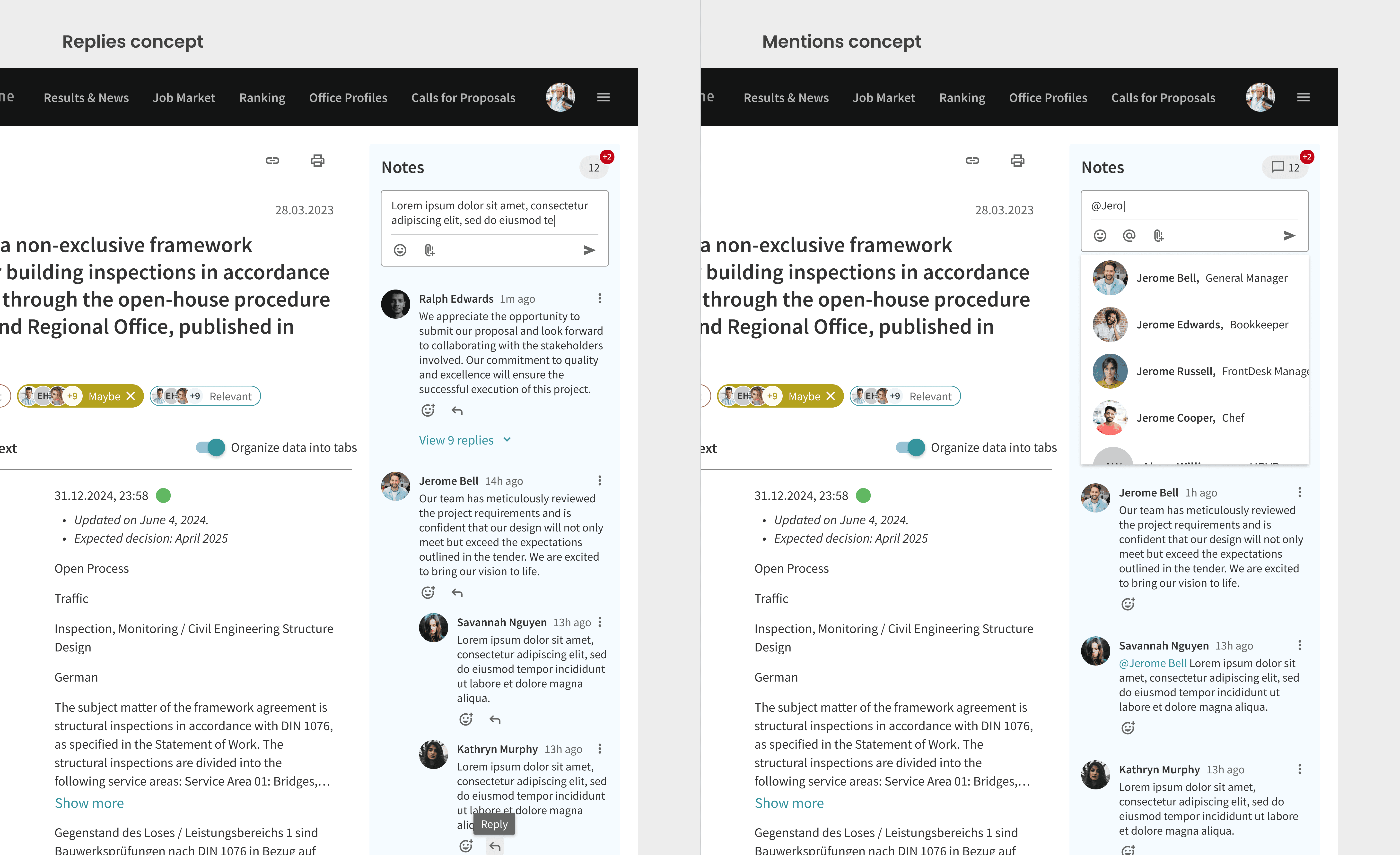
Two commenting concepts explored before aligning on the flat model with mentions
"During our collaboration, Oleksii was responsible for the UI Design and the development and maintenance of the Design System for the company. Based on the user requirements I analyzed from my research, he quickly created state-of-the-art UI designs independently, using his creativity and constructive questioning. At the same time, he was always open to adjustments and unusual solutions and advised me and our customers with suggestions from a UI design perspective. This resulted in UIs that were always very well received by end customers. It was a very pleasant and professional collaboration."
Kai Unruhe
Strategic Product Designer / Service Design / UX

Reflections
Working on a live product with a real user base changes how you design. You can't optimize for the ideal — you have to optimize for the real, which includes legacy constraints, existing habits, and code that predates your design decisions.
The design system conflict was the clearest example of this. I built something that looked correct in isolation and had to rebuild it around what was actually true. That's when I understood that a design system isn't a Figma file — it's an agreement between design and code.
The other thing I'd do differently: push for earlier alignment with the frontend on tokens and naming before building out components. The iteration cost was low in this case, but on a larger product it could be significant.