KONFIDAL —
COMPLIANCE PLATFORM
Designing and building a complete marketing website for a German B2B compliance and cybersecurity startup
A three-year client relationship that evolved into a full design-and-build cycle: a multi-page marketing website designed in Figma and implemented end-to-end in Framer — covering compliance services, cybersecurity offerings, and the visual strategy that made all of it feel like one coherent product.

Overview
Konfidal is a German B2B startup at the intersection of legal compliance and cybersecurity. Their services range from whistleblowing systems required under the German HinSchG law to phishing awareness training, penetration testing, and cyber insurance — services that businesses often need but struggle to understand or act on without guidance.
I started working with founders Fred and Martin in mid-2022 on a series of projects: an early web application, LinkedIn graphics, PDF presentations for clients and investors, and two earlier website iterations. The collaboration matured over three years. The final and most substantial project was designing a complete multi-page marketing website in Figma and implementing it end-to-end in Framer.

From wireframe to live site — the homepage structure defined early in Figma carried through to the final Framer build
My Role
Sole designer and Framer developer across the full website. Working directly with the founders, I took the product from a content PDF to a published, live marketing site.
Structured the information architecture across two service groups and 12+ pages
Designed all pages in Figma, adapting Untitled UI to the konfidal brand
Generated all website imagery using AI image tools — a deliberate choice to achieve brand-consistent photography
Built and deployed the complete website in Framer, which I learned during this project
Designed responsive layouts across desktop, tablet, and mobile
The Challenge
Making compliance feel human
Compliance and cybersecurity are genuinely important topics — but they're typically communicated through fear, legal language, and generic corporate imagery. The brief asked for something different: a website that felt accessible and trustworthy to business owners who aren't IT experts or legal professionals, without losing credibility with those who are.
One company, two very different service lines
Konfidal's seven offerings fall into two distinct categories: compliance services that respond to legal obligations, and cybersecurity services that respond to operational risk. These aren't the same buyer, the same trigger, or the same conversation. The challenge was presenting them as a single, coherent company without erasing the distinctions that help visitors recognize where they belong.
Content in, structure out
The client's input was a PDF of company messaging and service descriptions. Determining what goes on which page, in what order, and at what level of detail — that structural work was as much of the design problem as the visual execution.
All content on the site is in German. I don't speak German natively, which meant every structural and visual decision had to carry meaning independently of my ability to fully parse the text. This pushed me to treat hierarchy and layout as primary communication tools, and to stay in close contact with the founders about how content and design interacted.
What I Did
Information Architecture
The first structural decision was how to organize the navigation. Seven service offerings could easily become a flat, undifferentiated menu — the kind where visitors have to read every item to know what's relevant to them.
Instead, I grouped services by the problem they solve. "Compliance" covers the compliance side: whistleblowing systems, supply chain law, data protection. "Risikoprävention" (Risk Prevention) covers cybersecurity: training, phishing simulations, security checks, penetration testing, insurance. Both groups follow user logic, not company logic.
The split into Compliance and Risikoprävention reflects how these buyers actually enter the conversation. Someone facing a HinSchG compliance deadline and someone responding to a recent phishing incident are at fundamentally different starting points — different urgency, different vocabulary, different decision-making process. Grouping by problem type rather than by product allowed each visitor to orient immediately without reading the full menu.

Two-group navigation — services organized by the problem they solve, not by product category
A Consistent Template for Every Service Page
With seven service pages to design, I established a reusable page template at the start and built every service page on it:
Hero → Key benefits → Why this matters → How it works → FAQ → Newsletter → CTA
Each section serves a specific role. The hero reaches visitors who already know what they want. The "why this matters" section addresses visitors still evaluating. The FAQ surfaces and resolves objections before they're raised. The CTA closes when the visitor is ready.
Defining the template before designing individual pages meant design decisions compounded. A component refined on the HinSchG page automatically improved the Phishing Awareness page. It also made the Framer build significantly faster — once the template was live, each subsequent service page was assembly, not a rebuild.

Seven service pages, one template — consistent structure adapted to each service's content and context
AI-Generated Photography
Every image on the konfidal website was generated with AI tools. This was a deliberate decision, not a workaround.
Compliance and cybersecurity stock photography is notoriously weak — floating padlocks, faceless people in server rooms, generic handshakes. None of that would support a brand positioning around trust and human expertise. Professional photography wasn't in the project scope. AI generation filled the gap, but it came with its own challenge.
In early 2024, producing consistently professional AI-generated imagery — images that read as authentic in a real page layout, not just in isolation — required significantly more effort than writing a few prompts. Faces in complex social scenes, consistent lighting across a set, natural-looking hands: these were all weak points in the models at the time. Getting a set of images that could sit alongside editorial photography meant generating many variations, curating carefully, and always testing in the actual layout before committing. The final image set took real effort — but it produced photography that matched the brand's emotional tone in a way no stock library could have.

All photography on the site is AI-generated — curated for consistency in lighting, tone, and emotional register
Design to Browser
After design sign-off in Figma, I built the entire website in Framer — a platform I hadn't worked in before this project.
The decision to build it myself was partly a budget reality and partly an opportunity. Owning the full cycle meant I could make refinements during implementation without routing everything through a developer, and it gave me direct visibility into how design decisions translated to a real browser.
The site covers all pages across desktop, tablet, and mobile. The Framer implementation includes responsive layouts, a blog CMS, and an embedded contact flow.
Learning a tool on a live client project is different from tutorials. You encounter what actually matters — responsive overrides, component variants, CMS structure — not by studying them in advance but by running into them mid-build. What I delivered at the end of this project reflects skills I built entirely during it. Fred's specific note in his Upwork review: the speed at which I picked up Framer was one of the things he called out.
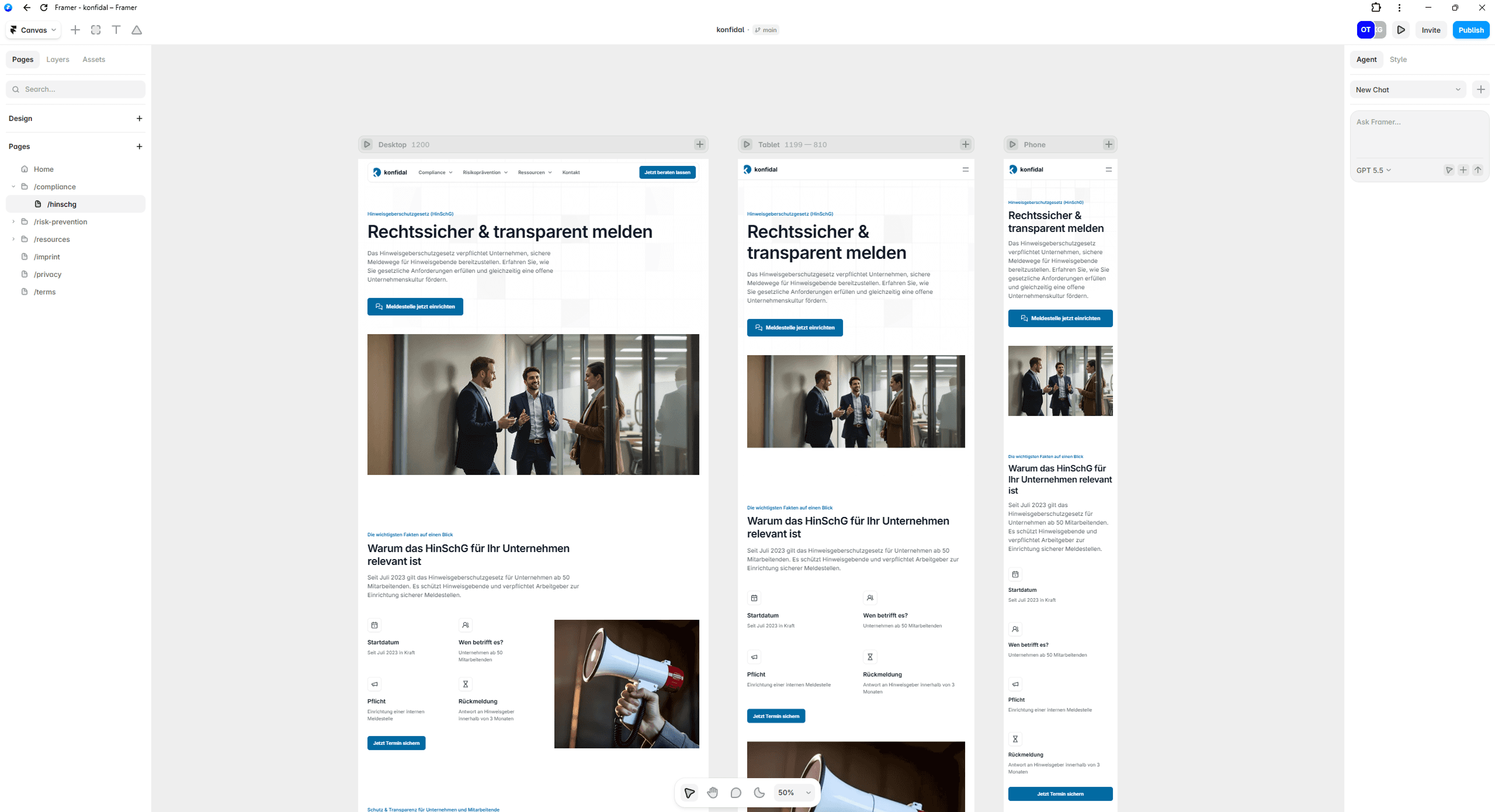
Designed in Figma, built and deployed in Framer — responsive across desktop, tablet, and mobile
It is a pleasure to work with Oleksii. He is fast, precise, creative and simply pragmatic. No matter what problem I came to him with, he always had a solution ready or knew how to get me to my goal, even if he couldn't help me with his expertise. He has created websites for me, designed book covers and layouts, developed apps in terms of UX and Ul, and much more. I will continue to work with him in the future and can highly recommend his work.
Martin Meng
Founder & CEO
Oleksii is THE most effective UX/UI designer for web/mobile that I worked with. On top of delivering with lightspeed, he also critically questions design decisions and makes sure that the outcome is always perfect. Even when the specifications were missing important details. Looking forward to future projects together!
Frederik Wegner
Founder & CTO

Reflections
This project stands apart from others in my portfolio because I owned the complete cycle: from the first wireframe to a published URL. That's a different kind of responsibility than designing for handoff — you feel the seams between design and implementation directly, and every ambiguity in the Figma file becomes your problem to resolve in Framer.
The AI photography work was the most unexpected creative challenge. It required editorial judgment I hadn't applied in design contexts before — evaluating whether an image would read as authentic to a visitor who's never thought about whether it was AI-generated. That's a different bar than "this looks realistic." Getting there took iteration and a specific kind of attention.
The three-year relationship with Fred and Martin also changed how I worked. By the time we started the final site, I understood their product well enough to make structural decisions — the navigation grouping, the page template — without needing to justify each one from first principles. That level of shared context is rare on freelance projects, and it's visible in the coherence of what we built.


