PAWNPARSE —
AI CHESS APP
Turning a three-panel "cockpit" concept into a guided, step-based AI flow
A German AI startup that converts photos of handwritten chess score sheets into PGN files. I redesigned the product around one core challenge: making a multi-stage AI process understandable and correctable at every step — without overwhelming the user with everything at once.

Overview
PawnParse is a web app that digitizes handwritten chess score sheets. Players photograph their scoresheet after a game; the AI detects where each move is written, reads the handwriting, and outputs a PGN file — the standard digital format used by chess platforms and databases worldwide.
The product solves a real operational problem: manually digitizing games from paper is tedious and error-prone, especially after a tournament with dozens of games. The challenge for design was different — making an AI pipeline feel like a simple, manageable task to players and organizers who don't think about OCR or bounding boxes.
I was brought in by the founder Alexander after a referral from a previous client. The product had a working ML model and a rough initial UI concept. My job was to design a flow that would take users from photo upload to PGN export in a way that was clear, guided, and honest about where the AI needed human help.
My Role
Sole UX/UI designer, working directly with the founder. I took the product from a rough initial layout concept to a complete set of Figma-ready screens covering the full user flow.
Audited the initial three-panel concept and proposed a restructured step-based flow
Designed the home screen/file dashboard, bounding box correction, data reading, label correction, and review/export screens
Covered all meaningful interaction states: file statuses, async processing stages, confidence indicators, correction patterns
Used a ready-made UI kit for the first time in practice — kept the visual layer fast so design effort concentrated on flow and interaction logic
The challenge
PawnParse sits at an unusual intersection: a technically complex AI process that needs to feel like a simple, manageable task to its end users.
What the product does, in plain terms
A chess scoresheet is a handwritten record of every move in a game — two columns, up to 60+ rows, written by hand during play. Between a photo of that sheet and a clean PGN file sits a backend that runs in two distinct phases: first detecting where each move is written (bounding boxes), then reading the text inside each box. Both phases can produce errors — and users need a way to catch and correct them.
Most of the product's users aren't developers or tech-savvy professionals. They're chess players, coaches, and tournament organizers — people who care about the output (a clean PGN file), not about the AI pipeline producing it. Designing for this audience meant simplifying the process without hiding the uncertainty. If the AI isn't sure about a move, the user needs to see that — not because it's technically interesting, but because it affects whether they can trust the result.
The starting concept: a cockpit
The founder's initial idea was a three-panel layout showing the original sheet, the AI's bounding box overlay, and the recognized moves simultaneously. On paper it offered maximum visibility. In practice, a first-time user facing three dense panels has no obvious starting point and no clear sequence of actions.
The design challenge: transform an inherently multi-step AI process into a flow that feels linear and manageable — without hiding the places where the AI needs human correction.
What I Did
Restructuring the Flow
The first decision was structural: step away from the three-panel layout and redesign the product as a guided, sequential flow. Rather than showing the user everything at once, the UI would give them one focused task at a time.
I proposed adding a home screen — a file dashboard — as the entry point, rather than dropping users directly into the processing pipeline. This gave the product a stable "home base": files are uploaded here, processing happens in the background, and users return here between sessions. From the dashboard, the flow breaks into three explicit steps: bounding box correction → data reading → label correction. Each step has a single task, a clear heading, and a progress indicator that shows where the user is in the sequence.

Home screen — upload zone at the top, file list with processing statuses below; users can track multiple files and jump directly to whichever step a file is ready for
Step 1 — Bounding Box Correction
After a file is uploaded and the AI runs its initial detection pass, the user sees their scoresheet with bounding boxes overlaid — one purple-bordered frame around each detected move cell. The step is titled simply "Bounding box correction."
At this stage, the user can add missing boxes, remove incorrect ones, or drag and resize any box that doesn't accurately cover a cell. A persistent note explains that moving to the next step locks this editing permanently — making the consequence of the action explicit before it's taken.
Exposing bounding box correction as a dedicated step — rather than skipping straight to recognition — was a deliberate choice. Most OCR errors don't originate in the recognition itself; they originate in incorrect or noisy input regions. Giving users control over what the AI reads before it reads anything shifts them from passive observers to active participants in the AI's accuracy. It reframes the relationship: this is a collaborative process, not a black box that either works or doesn't.

Step 1 — AI-detected bounding boxes overlaid on the original scoresheet; users can add, drag, or resize any box before recognition runs
Step 2 — Data Reading
After bounding boxes are confirmed, text recognition runs. The screen shows a three-segment progress indicator — step 1 (complete), step 2 (active, with a live percentage), step 3 (pending) — along with a brief description of what the AI is processing. There's no other action available; the user waits.
The design goal for this screen was to make waiting feel transparent rather than opaque.
A single spinner creates uncertainty — users can't tell if the system is stuck, slow, or nearly done. Splitting the backend process into named phases and showing a percentage within the active step removes that anxiety. It also prepares the user for what comes next: by the time the progress bar reaches step 3, they know that a correction step is coming and roughly what it will ask them to do.
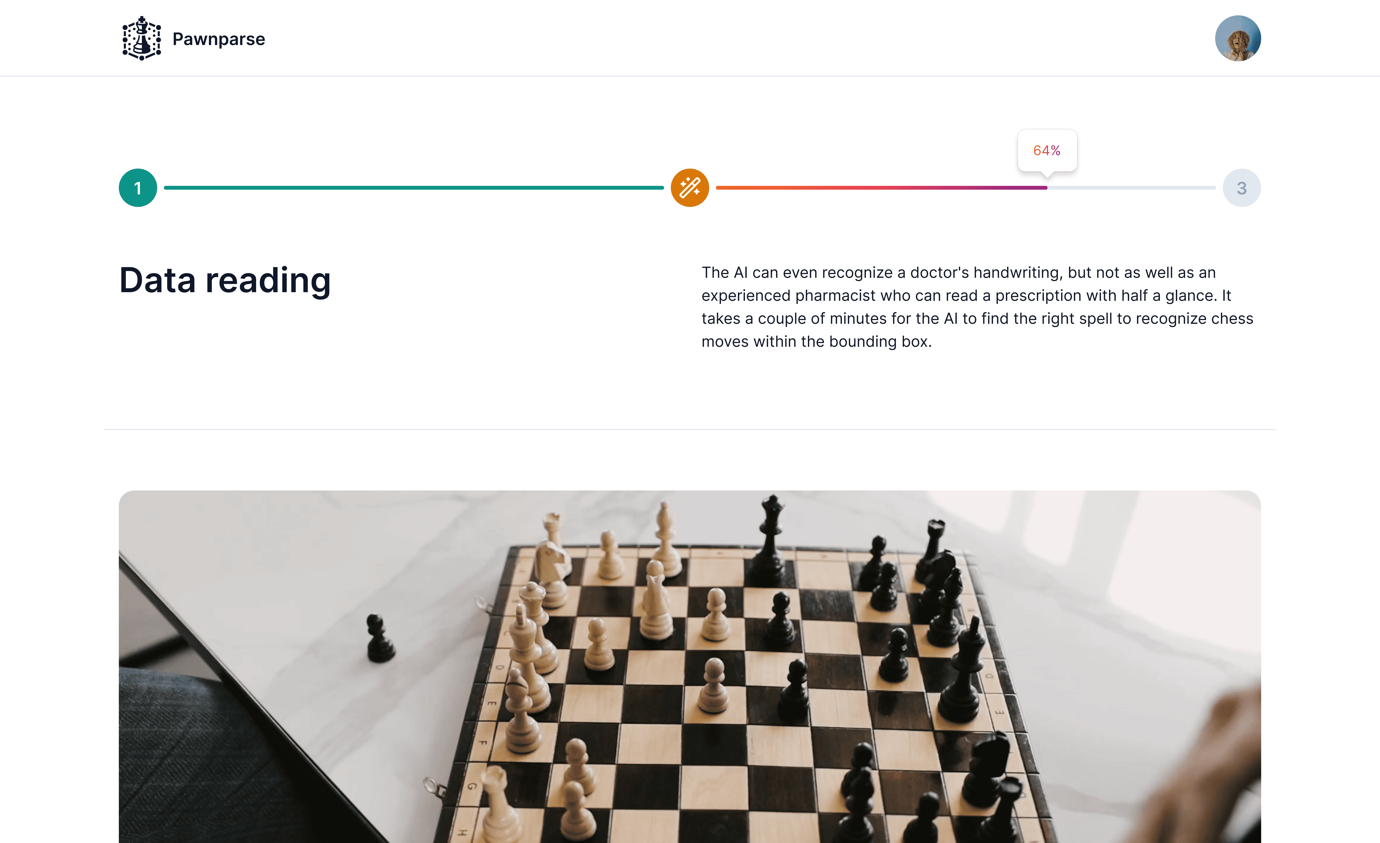
Step 2 — staged progress bar makes the AI's pipeline visible; users see which phase is running and how far it has progressed
Step 3 — Label Correction
This is the most complex step and the core of the editing experience. The screen splits into two halves: the original scoresheet photo on the left, and on the right — game metadata above and a moves table below.
Each move in the table has an accuracy rating shown as a five-star indicator: fully-filled green stars for high-confidence recognitions, partially-filled orange stars for uncertain ones, and red/empty stars for low-confidence results. Once a user manually corrects a move, "Edited by user" replaces the rating.
Confidence indicators change the user's task from "review everything" to "fix what needs fixing." Without them, a user faces a 40-move game and no way to know where to focus — they either check every row or trust the AI blindly, neither of which is good. With confidence ratings, they can scan the table in seconds, jump directly to orange and red rows, and be done. It also makes the AI's overall accuracy visible: a game with mostly green stars tells the user that recognition worked well before they've checked a single move. That's information that builds trust rather than requiring it upfront.

Step 3 — accuracy rating per move; users focus on low-confidence cells rather than reviewing the full game linearly
Review & Export
The final screen presents all recognized moves in a clean two-column table — white moves on the left, black on the right — alongside the original scoresheet photo, with game metadata at the top. Users can compare the output against the original before exporting.
The layout answers a simple final question: "Does this match what I see on the paper?" If yes, the user downloads the PGN file. The original scan stays visible throughout this step so that comparison never requires switching screens.

Review — original scan alongside the structured move table; users verify before PGN download
Reflections
PawnParse was a short project — about three months — but it compressed a specific set of design problems I hadn't worked with before: async processing states, AI confidence visualization, and the handoff point between machine output and human correction.
The core shift was structural. The three-panel concept tried to give users everything at once; the redesign gave them one task at a time, in the order that the process naturally required. That change didn't add features or screens — it changed what the product felt like to use.
The product launched and attracted real users. It was used at the Deutsche Jugendeinzelmeisterschaften — the German Youth Individual Chess Championships — in Willingen in May 2024. One user described the interface as "intuitive" and the PGN export as "simple." Those two words are the goal of the entire design.


