AMWORK —
ALL-IN-ONE PLATFORM
Designing a B2B platform that replaces five tools at once
A no-code workspace builder for SMBs. I joined as the sole designer when the product was still taking shape and stayed for 16 months, designing ~18 modules from scratch.
Overview
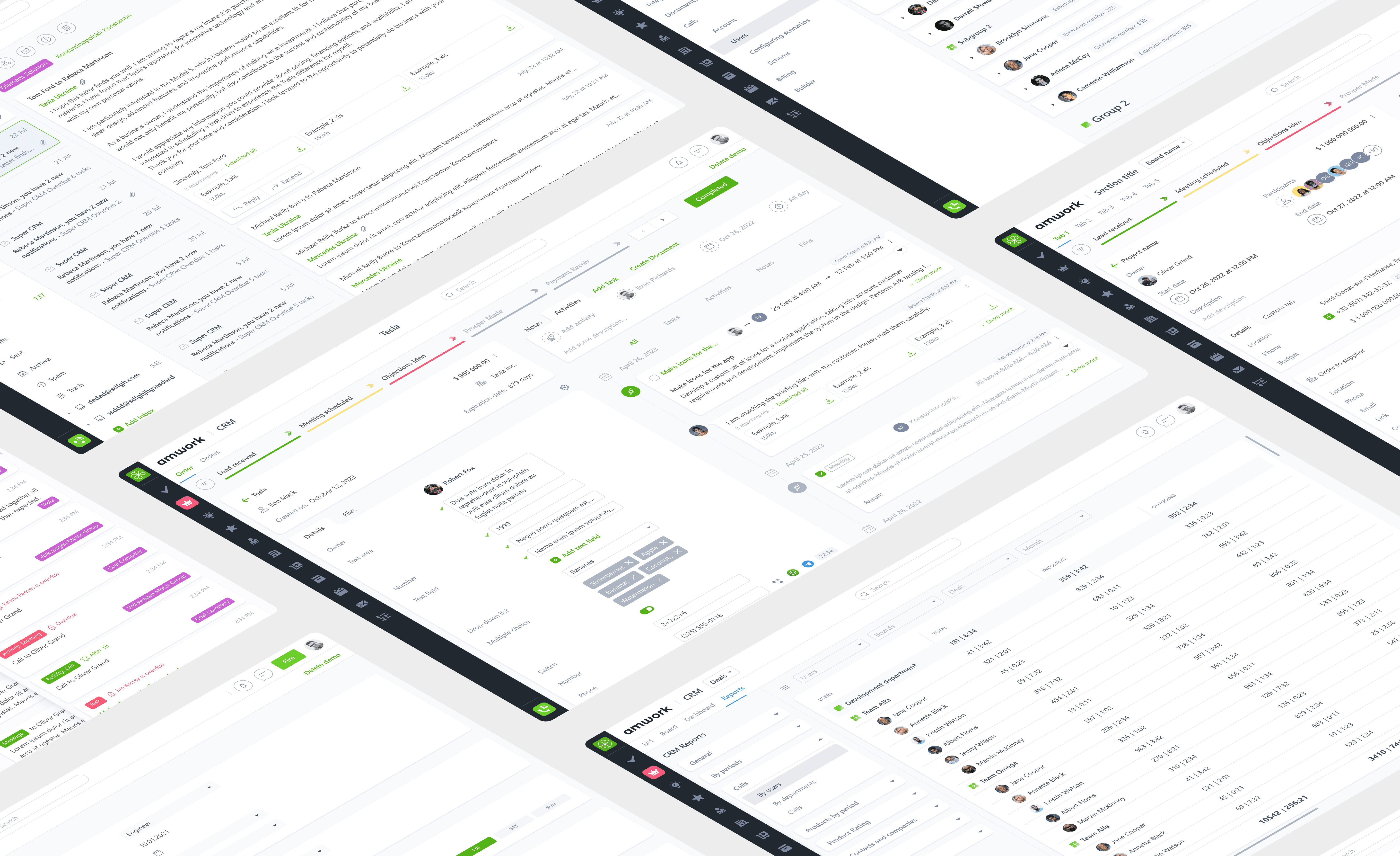
Amwork is a no-code workspace builder for small and medium businesses — a single platform combining CRM, task management, inventory, hiring, scheduling, and more. Clients choose which modules they need; if something doesn't exist yet, the team builds it.
I joined as the sole UX/UI designer when the product was still taking shape. Over 16 months, I designed around 18 modules from scratch — from the first user flows to developer-ready files.
My Role
Sole UX/UI designer across the entire product. I owned the end-to-end design process for each new module — from user flows to developer-ready Figma files.
Designed ~18 product modules from scratch
Built and maintained a shared component library in Figma
Collaborated with founder (PM), 1 frontend, 2 backend developers
Contributed to marketing site, social assets, and investor presentations
The challenge
Amwork wasn't a product with a fixed scope. New modules appeared almost every few weeks. The core design challenge: move fast without breaking consistency — every new module had to feel like part of the same platform.
Starting from incomplete foundations
I inherited early screens from a previous designer — rough direction, but inconsistent and not always reflecting current business logic. I treated them as input, not a source of truth.
Unifying very different tools under one UI
Amwork combines dense data tables, multi-step pipelines, calendar views, and communication tools. I established reusable patterns for navigation, filtering, forms, and status indicators across all modules.
Designing in real time with the business
Morning call → I structure the flow → 1–2 days later a proposal → refinement with devs. Documentation stayed lightweight, the component library had to support fast iteration.
Selected modules
A few examples from the ~18 modules I worked on.
Inventory & Warehouse
The Warehouse module lets businesses manage products, track stock across locations, and handle shipments. The main view is a dense data table built for efficiency: multi-select, inline filtering, and bulk actions.
Bulk-action controls (Relocate / Delete) appear at the bottom of the screen only when items are selected — keeping the toolbar clean in the default state and avoiding noise for single-item operations.

Product list with multi-select and contextual bulk actions
The product detail page balances structured metadata — SKU, warehouse, category, variants — with a flexible image gallery. Secondary data is organized into tabs (Prices / Variants / Images / Stock) to avoid overwhelming the initial view while keeping everything accessible.

Product detail page with structured metadata and image gallery
Product set creation
One of the more unusual challenges: designing a UI for creating product bundles. There were no established patterns I could reference for this specific case, so I had to work out the interaction from scratch.
A split-panel layout. The bottom panel shows the full warehouse inventory with search, filters, and multi-select. The top panel shows the set being assembled. Items move from bottom to top via an Add button; each panel has its own independent controls. This let users build a bundle without losing context of the full inventory.

Split-panel interface for assembling product sets
HR management
The HR module needed to surface employee status at a glance across a potentially long list. The key decision was the status column: color-coded badges (Works / On vacation / Sick leave / Fire) make the most important information immediately visible without opening individual records.
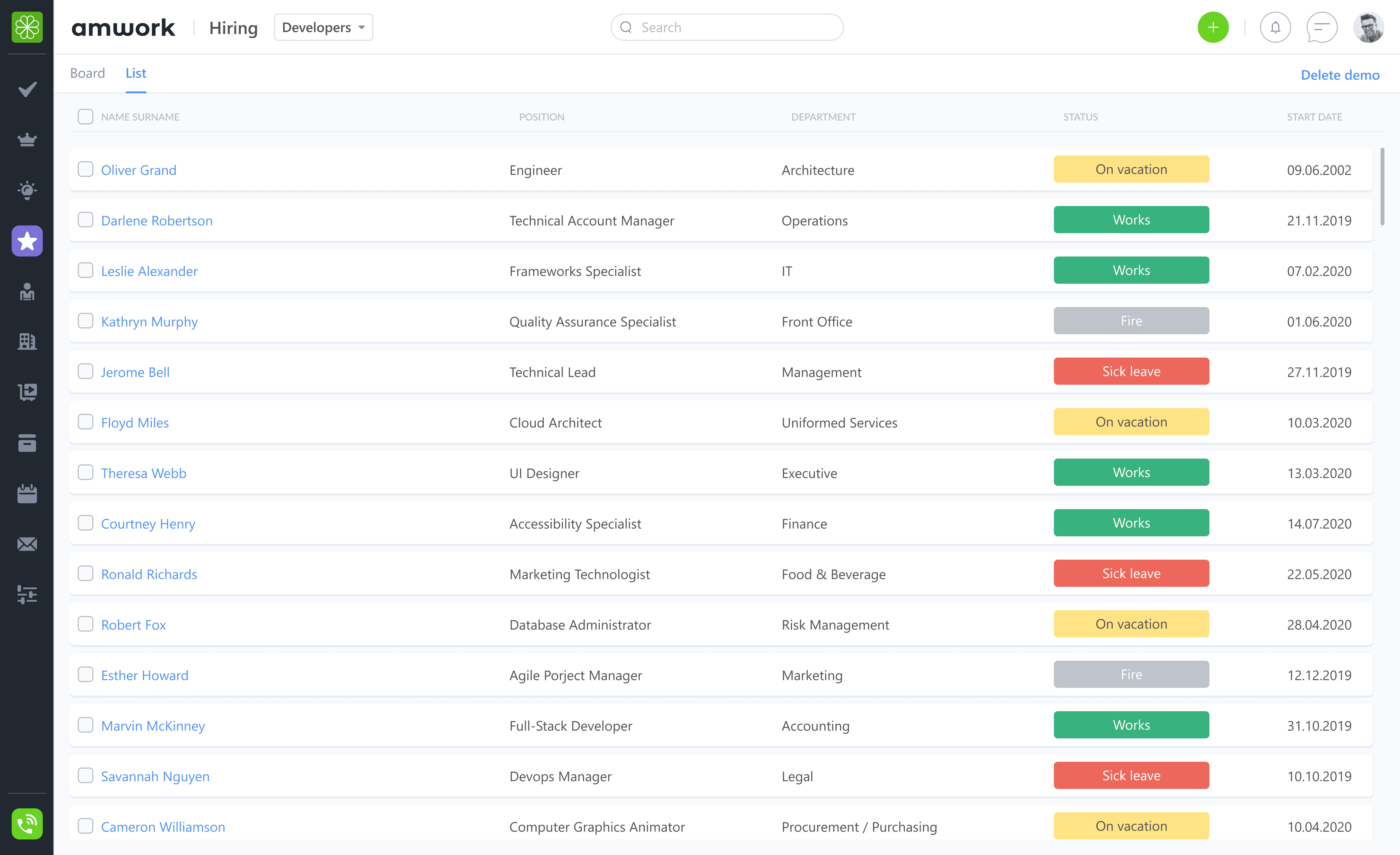
Employee list with status indicators
Scheduler
The Scheduler was one of the more complex views: a time-based grid showing appointments per team member, color-coded by client or type. The challenge was making it readable when multiple people have overlapping events. The solution was a column-per-person layout with color differentiation — avoiding the ambiguity of a shared calendar while keeping everything on one screen.

Team scheduler showing appointments by employee across the day
Multi messenger
The messenger consolidates internal team communication with external channels — Facebook, WhatsApp, and others — into a single inbox. The goal wasn't to build a full chat product, but to reduce context switching: all client and team communication visible from within the same platform where work happens.

Unified messenger combining internal chat with external channels
Other modules
Other modules I designed:
HR
Tasks & Activities
CRM
Billing
Plan/Fact Time
Notification
Calls
And more...
UI Foundation
To maintain consistency across ~18 modules, I built a shared component library in Figma: buttons, inputs, dropdowns, checkboxes, modals, tooltips, and more. It wasn't a formally structured design system — but it served as a practical foundation that let me move fast and keep the UI coherent as the platform grew.

Component library built to support fast iteration across all modules
How I Worked
For each new module, my typical flow:
1.
Kick-off
The founder described the business goal and shared references or examples
2.
Structure
I mapped user flows and screen hierarchy in Figma before touching visuals
3.
Design
Key screens, edge cases, empty states, and interaction states
4.
Review
Discussion with the founder and developers, trade-offs and adjustments
5.
Handoff
Developer-ready Figma files with support during implementation
Outcome
Amwork is a live product, currently available and actively sold. Over 16 months, the platform grew from a set of early-stage drafts to a working multi-module workspace used by real clients — including at least one business that adopted the appointment scheduling module for a chain of beauty salons.
As the sole designer across the entire product, I learned how to prioritize under pressure, communicate constraints clearly, and build a consistent experience without the luxury of a full research process.
Reflections
Looking back, I'd invest more in the component library earlier in the process — a stronger foundation would have saved significant time on later modules. I'd also push for even a lightweight research layer: a few conversations with actual users in the early stages would have surfaced assumptions we ended up revisiting later. But the pace was real, and learning to design well under those constraints was its own lesson.