WHO'S WHO —
BUSINESS PLATFORM
Designing a premium business visibility platform from information architecture to full UI
A premium directory and industry platform for the Iraqi market — somewhere between Forbes, LinkedIn, and a business publication. I designed the entire product from scratch: public platform, user dashboard, monetization flows, and communication system.

Overview
Who's Who is a premium business platform designed for the Iraqi market, with ambitions to expand across the Middle East. The product sits at the intersection of a business directory, an executive network, and an industry publication — a single destination where companies build credibility, leaders establish presence, and decision-makers discover opportunities.
The platform combines company listings, executive profiles, industry content, events, jobs, and business promotion tools into a unified ecosystem. The goal isn't simply to list businesses — it's to create a trusted environment where visibility translates into real opportunities.
I designed the product from scratch as the sole designer, covering everything from information architecture to final UI. The product is currently in Figma, pending final client sign-off before development.

Industries mega-menu — the primary navigation entry point, grouping six content areas with subcategories
My Role
Sole UX/UI designer across the entire product. Working directly with the client, I took the product from a brief and a rough wireframe sketch to a complete Figma-ready design covering both the public platform and the authenticated user experience.
Defined the information architecture for both the public platform and user dashboard
Designed the full public experience: homepage, industries, companies, leaders, newsroom, events, magazine, jobs
Designed the user dashboard: business registration wizard, listings, services, events, job openings, subscriptions, promotions, inbox
Created a premium visual language aligned with the client's positioning goals
Designed monetization flows, subscription tiers, and a six-type promotions system from scratch
The challenge
Who's Who wasn't a website project — it was a platform project. That distinction shaped every decision I made.
Defining what this product actually is
The brief combined elements of several familiar products: a business directory, an executive network, a content publication, an events platform, and a jobs board. The challenge wasn't designing any one of these — it was making them feel like a single coherent product rather than five tools bolted together.
Designing for multiple user types simultaneously
The platform serves fundamentally different audiences: business owners who want visibility, professionals who want to discover opportunities, recruiters who want to reach candidates, and visitors who want to find service providers. Each audience needed a clear path through the same product without the experience feeling fragmented.
Scaling complexity without losing clarity
As the scope grew from a website into a full platform with authenticated flows, the risk was complexity creeping in at every level — navigation, dashboard structure, feature grouping. Keeping things intuitive under that pressure required deliberate IA decisions, not just visual solutions.
Information Architecture
Before designing a single screen, I had to define how the entire platform was structured: what content types exist, how they relate to each other, where features live, and how different user roles move through the product.
The public navigation surfaces six content areas — Industries, Companies, Leaders, Magazine, Events, Jobs — through a mega-menu that groups them logically. The Industries section serves as the primary entry point, since most user journeys on the platform start with an industry context.
The dashboard structure was organized into four groups: Manage Business, Growth & Visibility, Communication, and Account — each mapping to a distinct user goal rather than to system categories. Subscriptions and Promotions live under Growth & Visibility rather than Account Settings, because businesses on this platform aren't thinking about billing — they're thinking about visibility.
The main shift in thinking was moving from designing pages to designing an ecosystem. Every structural decision had downstream consequences — where a feature lives changes how often it gets used, which changes what the product actually does for its users. Getting the architecture right before touching visuals was what made the rest of the design coherent.
Platform structure — Public Platform and User Dashboard as two distinct but connected ecosystems
Public Platform
Homepage
The homepage establishes the product vision — combining editorial content, business discovery, and search in a single view.
Typography does a lot of work here: Cormorant Garamond for editorial headlines creates an authoritative, publication-like feel, while Inter handles all UI elements. The color palette — dark warm neutrals with a refined gold accent — was calibrated to read as luxury without tipping into flashy. Below the hero, the page breaks into Featured Companies, industry exploration by sector, latest news, upcoming events, and a jobs section — giving every visitor type a clear entry point from the same homepage.
The client's reference point was "something between Forbes and LinkedIn." That's a specific positioning: trust and editorial authority on one side, professional network utility on the other. The visual language had to earn that positioning rather than just claim it.

Homepage — editorial hierarchy, business discovery, and search combined in a premium layout
Company Profile
The company profile page is where the platform's core value proposition lives — it's the page that businesses pay to maintain and upgrade.
A single-scroll layout wouldn't work here: the amount of structured content (services, job openings, events, gallery, reviews, location, contact) would either overwhelm the page or force the business to show everything at once regardless of what they actually offer. The solution was a tab-based structure with eight sections: About, Services, Special Offers, Open Positions, Events, Gallery, Reviews, and Contact.
Tabs let each business show only what's relevant to them without exposing empty sections to visitors. A company with no events simply doesn't surface that tab. This keeps profiles feeling complete and purposeful regardless of how much content a business has actually added — and gives the premium tier a clear advantage through richer content across more tabs.

Company profile — tab structure managing content depth across eight categories
Leader Profile
The Leader Profile is the most distinctive page on the platform — and the most different from anything I'd designed before.
This isn't a contact card or a bio page. It's closer to an editorial profile: a ranked, verified record of a business leader's companies, achievements, expertise, and press coverage. The page includes a Who's Who Ranking position, Awards & Recognition, a timeline of Key Achievements, a Companies & Ventures section, Expertise & Industries tags, and a curated Media & Press section with publication logos and article headlines.
On the right side, a persistent Contact form lets visitors reach the leader directly — keeping the lead generation loop intact even on a content-heavy page. The Prestige Collections (Top 100 Leaders, Women in Leadership, Rising Leaders) extend this concept into a curated editorial format, giving the platform an additional content layer beyond individual profiles.

Leader profile — combining editorial ranking, verified achievements, and direct contact in a single page
User Dashboard
Dashboard Overview
The main dashboard gives business owners a quick read on their platform activity: active listings, total views, pending reviews, and a views trend chart. Below the metrics, two panels surface what matters most day-to-day — active listings with their statuses, and active promotions.
The sidebar navigation reflects the four-group IA structure — Manage Business, Growth & Visibility, Communication, and Account — making it immediately clear how the dashboard is organized and where to go for different tasks.
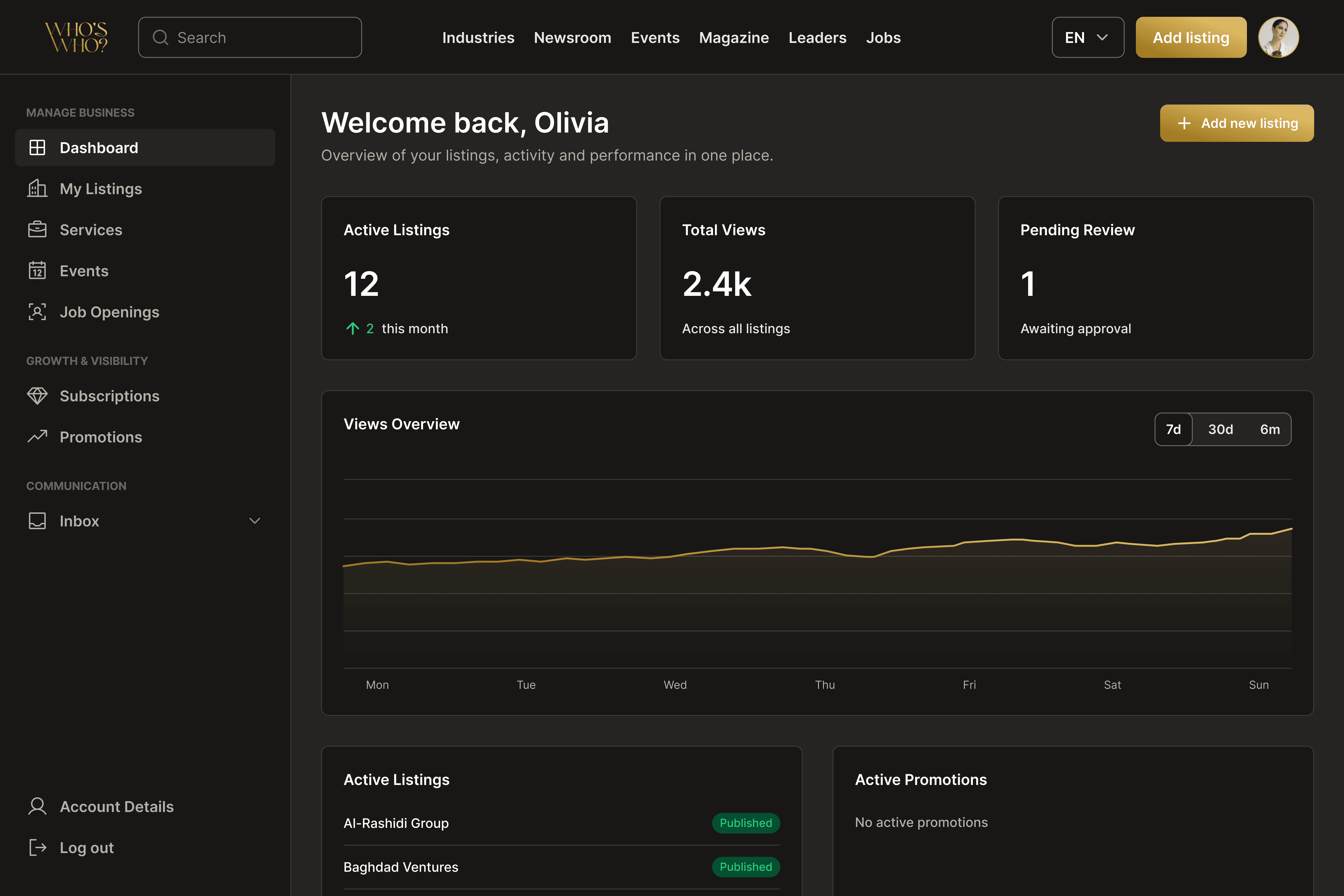
User dashboard — business activity at a glance, with structured navigation reflecting the platform's IA
Business Registration
Adding a business to the platform follows a five-step wizard: Basic Information, About Company, Media, Contacts, and Preview before publishing.
Each step focuses on one category of content, keeping the form manageable even though the total amount of information is significant. A live preview of the listing card updates in real time as the user fills in details — giving immediate visual feedback on how their profile will appear to visitors before they commit to publishing.

Business registration wizard — five focused steps with a live card preview
Subscriptions
The subscription page shows the user's current plan and presents the three available tiers: Standard (Free), Premium ($99/month), and Featured ($249/month).
The tier differentiation is clear and visual: each plan lists its specific benefits, with Featured highlighted as Best Value. Monthly and annual billing toggle at the top. The current plan is marked with a disabled button — so the user always knows where they stand without ambiguity.
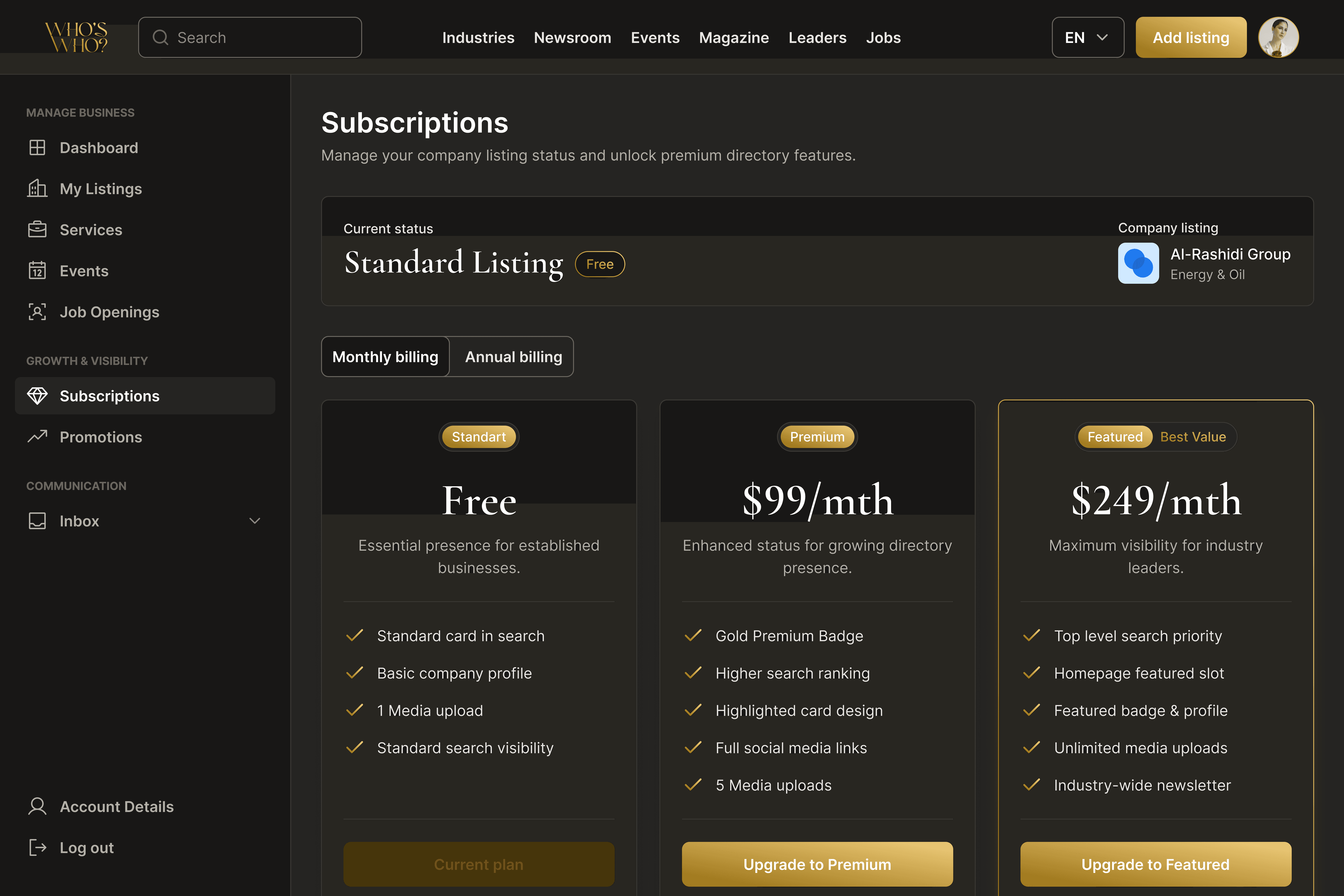
Subscription tiers — clear differentiation between Free, Premium, and Featured plans
Promotions
The Promotions section is the most complex flow in the dashboard. Businesses can run six types of campaigns: Feature Company, Boost Job Opening, Boost Event, Boost Service, Sponsored Article, and Custom Campaign.
The entry point is a type-selection screen — six cards, each describing a specific campaign goal and the type of content it promotes. Only after selecting a type does the wizard begin, adapting its fields and steps to match exactly what that campaign requires.
Starting with type selection rather than a generic form was essential. Each campaign type has a different object (a listing, a job, an event, a service), different targeting options, and a different editorial review process. A single form would have forced users to navigate irrelevant fields and make decisions without context. The selection screen makes the system immediately comprehensible — you see your six options, pick the one that matches your goal, and the wizard takes it from there.

Promotion type selection — six distinct campaign goals, each leading to a tailored wizard flow
Inbox & Lead Management
The Inbox is where platform enquiries become business conversations.
When a visitor contacts a business through a company profile, service listing, or job opening, it creates a conversation thread in the dashboard inbox. The three-panel layout — navigation with conversation list on the left, message thread in the center, lead details drawer on the right — keeps everything needed to manage a lead visible without switching between screens.
The empty state was designed as an onboarding moment, not just a placeholder. It explains the three-step flow — visitor finds your listing → they send an enquiry → you reply here — and links directly to improving profile visibility. The goal was to make a new user understand what the Inbox is for and what action would make it useful, rather than leaving them with a blank screen.

Inbox — three-panel layout combining conversation management and lead details in a single view
Reflections
Who's Who was the most complex product I'd designed to that point — not because of the visual challenges, but because of the scope of decisions that preceded any visual work.
The shift from designing pages to designing an ecosystem changes how you think about every decision. Where a feature lives, what it's called, which group it belongs to — these aren't just organizational choices, they're the product experience. A business owner who finds Promotions under Growth & Visibility instead of burying it in Account Settings is more likely to actually use it. That's the kind of impact that's invisible in the final UI but real in how the product gets used.
Working at this scale as a sole designer also meant making a lot of decisions without the ability to test them with users. Some choices were based on established patterns, some on conversation with the client, some on my own judgment about what would feel right. That's the honest reality of solo product design — and learning to make defensible decisions under those conditions was the biggest thing I took from this project.


