
Zruchno —
Easy Hire
Zruchno started as a course project, but I treated it as a real product challenge. I wanted to explore how to make it easier for people to find reliable help for everyday tasks like cleaning, repairs, and assembly — without scrolling through endless chats and random ads.
Background & Problem
Zruchno is a mobile app concept for finding and hiring workers to handle everyday household tasks: cleaning, small repairs, furniture assembly, and more.
During research and interviews, I noticed the same pattern: people spend a lot of time searching in chats, asking friends, and scrolling through random ads — and they still don’t fully trust the person they end up hiring.
The core problem I focused on:

Olena
34 years old, mother of two
It’s hard to know if I can trust a stranger in my home.

Mariia
21 years old, student
I usually ask friends in chats, but it takes time.

Serhii
52 years old, retired
Sometimes finding a specialist requires too much effort.
My Role
I worked on Zruchno as a solo UX/UI Designer during a course, but I treated it as a real product challenge. I was responsible for the full design process:
Competitive research (including services like Taskrabbit).
Defining the information architecture and main user flows.
This gave me a chance to go through a complete UX cycle on my own — from understanding the problem to a finished interface.
Research: Competitors & Users
I started by analyzing competitors like Taskrabbit to understand how they structure categories, build trust, and guide users through task creation.
Then I conducted user interviews to learn how people currently search for help with home tasks, what frustrates them, and what would make them feel safe and confident using a service like Zruchno.
A few recurring insights:
Trust and safety are critical — letting a stranger into your home is a big decision.
Current solutions (chats, ads, friends’ recommendations) are slow and fragmented.
People want a fast, mobile‑first way to describe their problem and compare a few trusted options.
Excerpt from an interview with respondent Olena:
What do you do when you are faced with a task that you are unable to do yourself (for whatever reason: lack of time, knowledge, or simply desire)?

When I encounter a task that I cannot complete on my own, I typically seek assistance from others. As a mother of two and a freelancer, I often find myself short on time. For instance, if I need to conduct a thorough cleaning or repair something in my home, I contact professional services or ask acquaintances for recommendations. The ability to hire someone through a convenient app would be very useful.
Conclusion
The respondent trusts professional services and acquaintances. Often limited in time, therefore requires a convenient interface for quickly hiring professionals.
Decision
Mark service providers (perhaps with badges) to indicate whether they are companies or individuals. Add an intuitive interface for searching and hiring specialists, with filters for quick searches.
Product Structure
Before diving into UI design, I defined the structural foundation of the app. I mapped out core sections, user flows, and navigation to ensure clarity and scalability. The product is divided into essential modules such as onboarding, task creation, chat, task management, and settings — all tailored to support a seamless and focused user experience.

Lo-Fi Wireframes
I created low-fidelity wireframes to validate ideas quickly and focus on layout, hierarchy, and key interactions. This stage helped align structure with user expectations and paved the way for efficient visual design.

UX Goals
Based on the research, I defined several UX goals for Zruchno:
Speed
Make it fast and simple to create a task.
Trust
Increase trust in specialists through transparent profiles and reviews.
Comparison
Make it easy to compare a few relevant taskers instead of browsing endless lists.
Mobile-first navigation
Keep navigation predictable and mobile‑friendly for everyday use.
UX / UI Solution
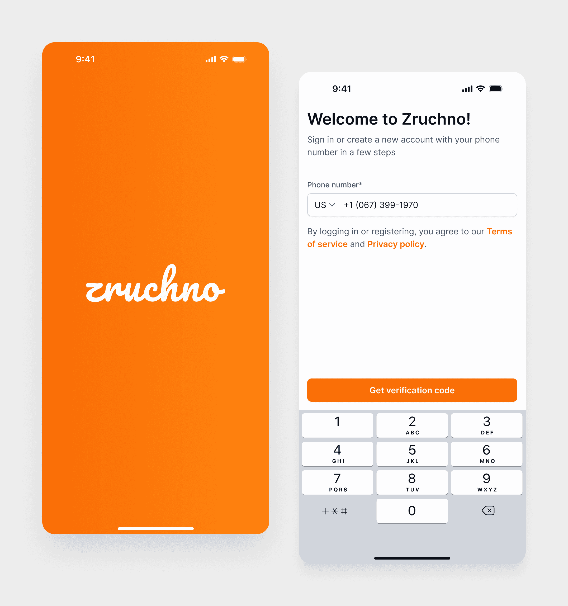
I designed Zruchno as a mobile service marketplace, where the main goals for users are to quickly find the right category of services, create a task, and choose a trusted tasker. The key UX decisions focused on: the structure of the home screen, a clear 4‑step task creation flow, and a bottom navigation that supports everyday use of the app.
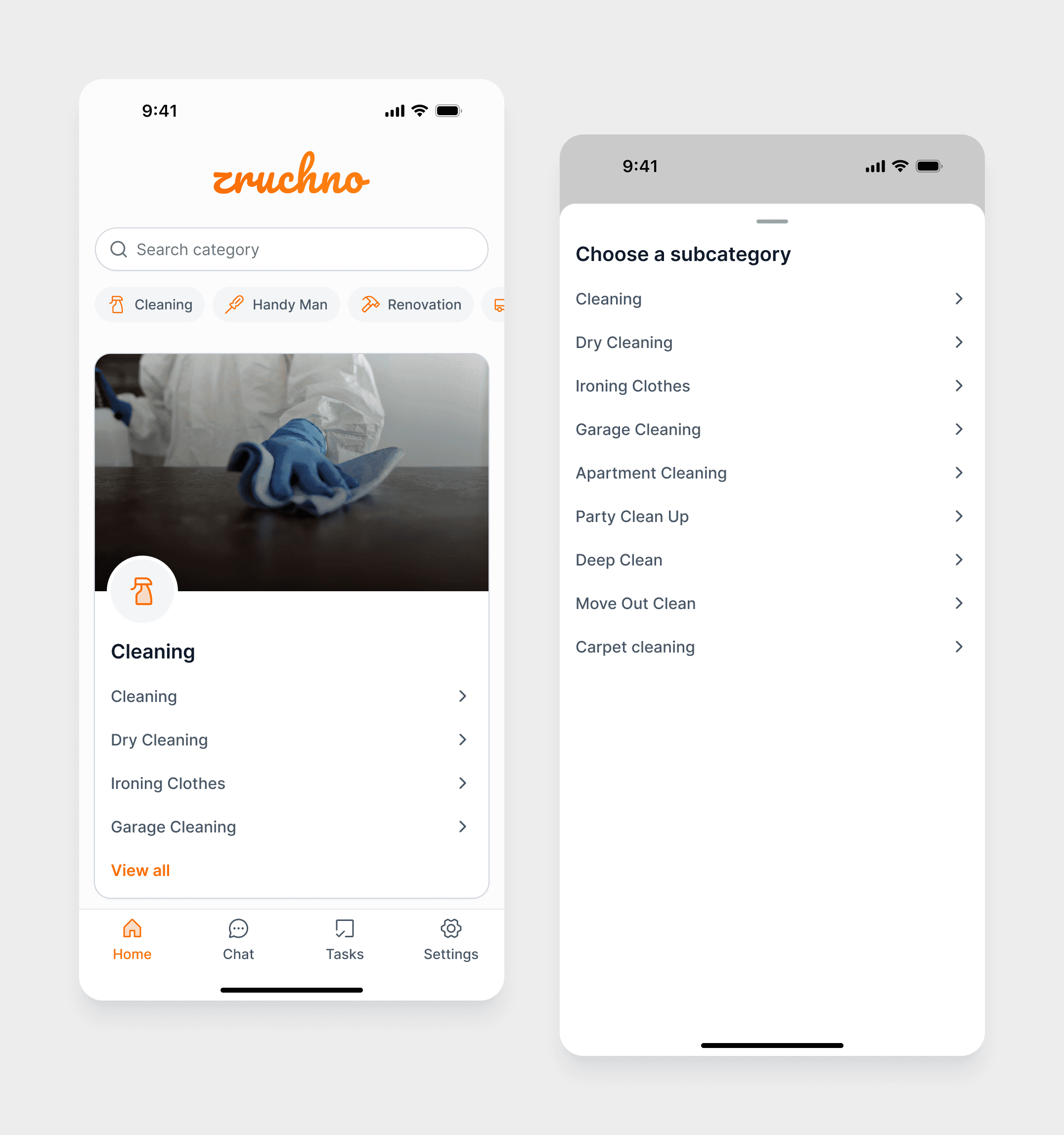
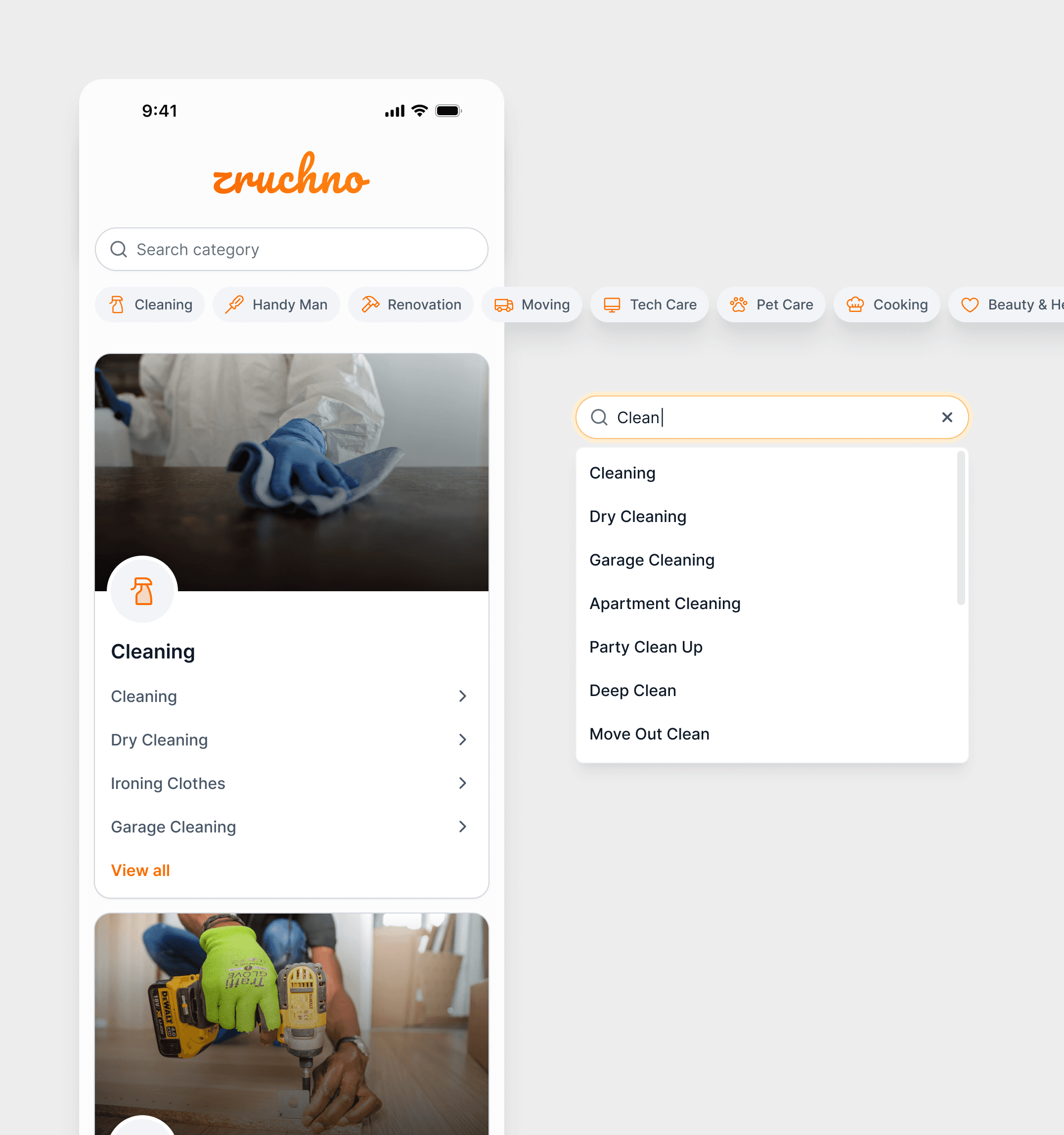
Home Screen
The home screen combines a search bar, category pills as anchor links, and rich category cards with images, icons, and subcategories.
Users can either scroll to explore or jump directly to a specific category, and search surfaces both categories and subcategories.
Task creation: a 4‑step guided flow
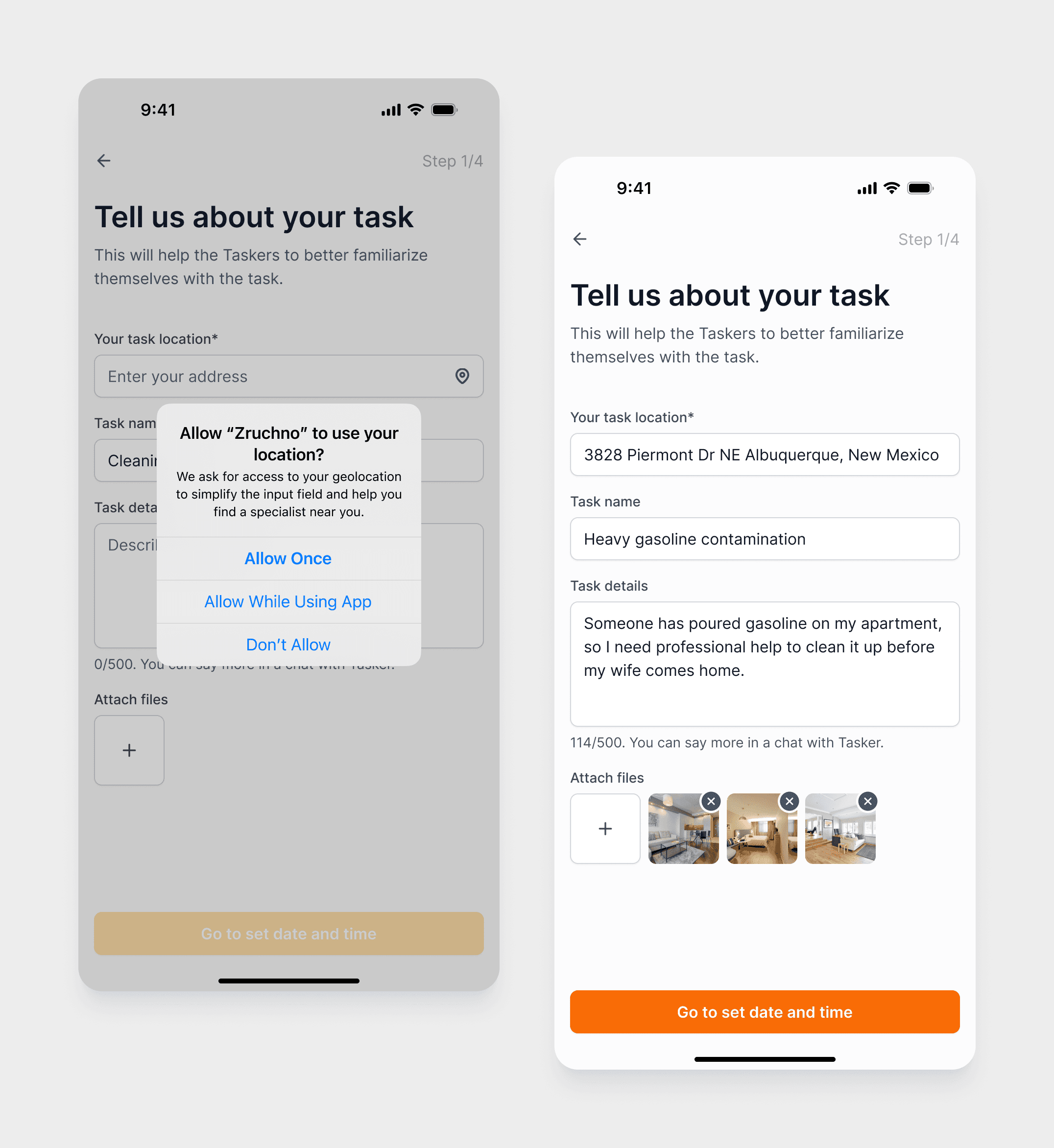
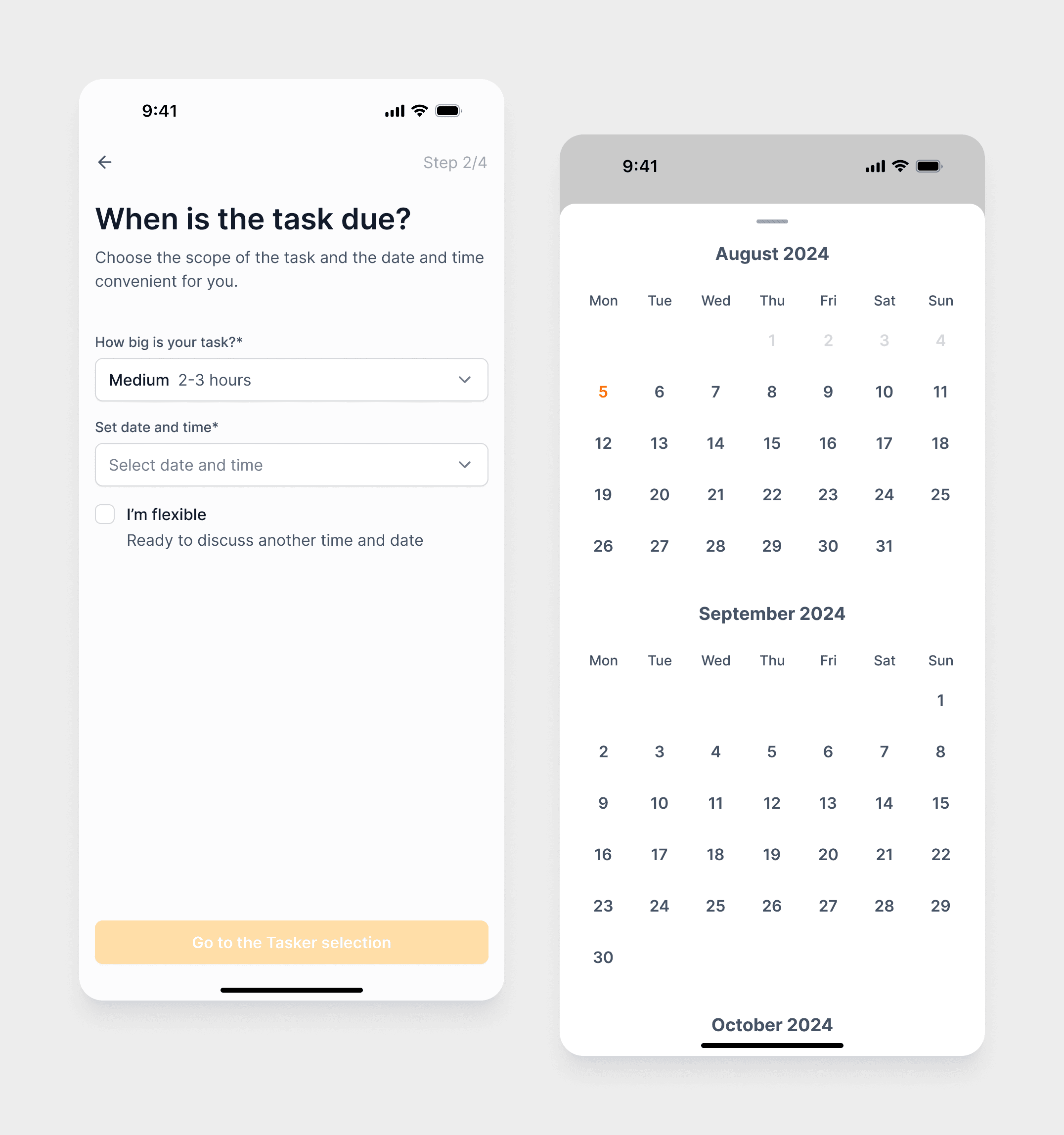
The task creation process is split into four sequential steps to avoid one long, overwhelming form and to make the experience more structured and manageable.
Step 1 – Address & basic info
Users set the address (manually or via geolocation), write a short task title, add a description, and can attach photos or videos. This gives taskers enough context before they even look at timing and volume.
Step 2 – Scope & timing
The task size is simplified into three levels (Small, Medium, Large), and users choose a date and time, with an optional “I’m flexible” option to indicate they’re open to alternatives.
Step 3 – Choose a tasker
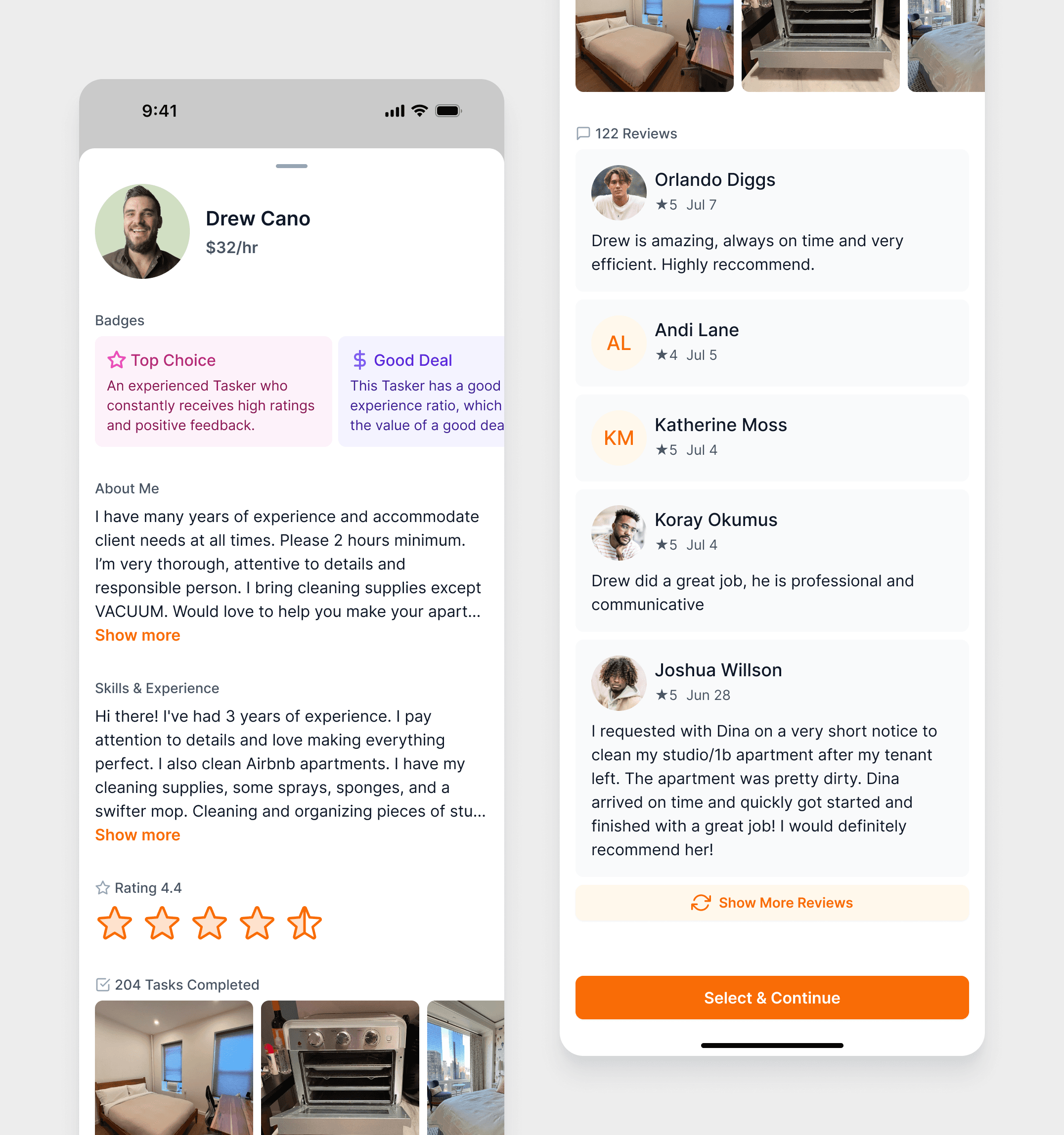
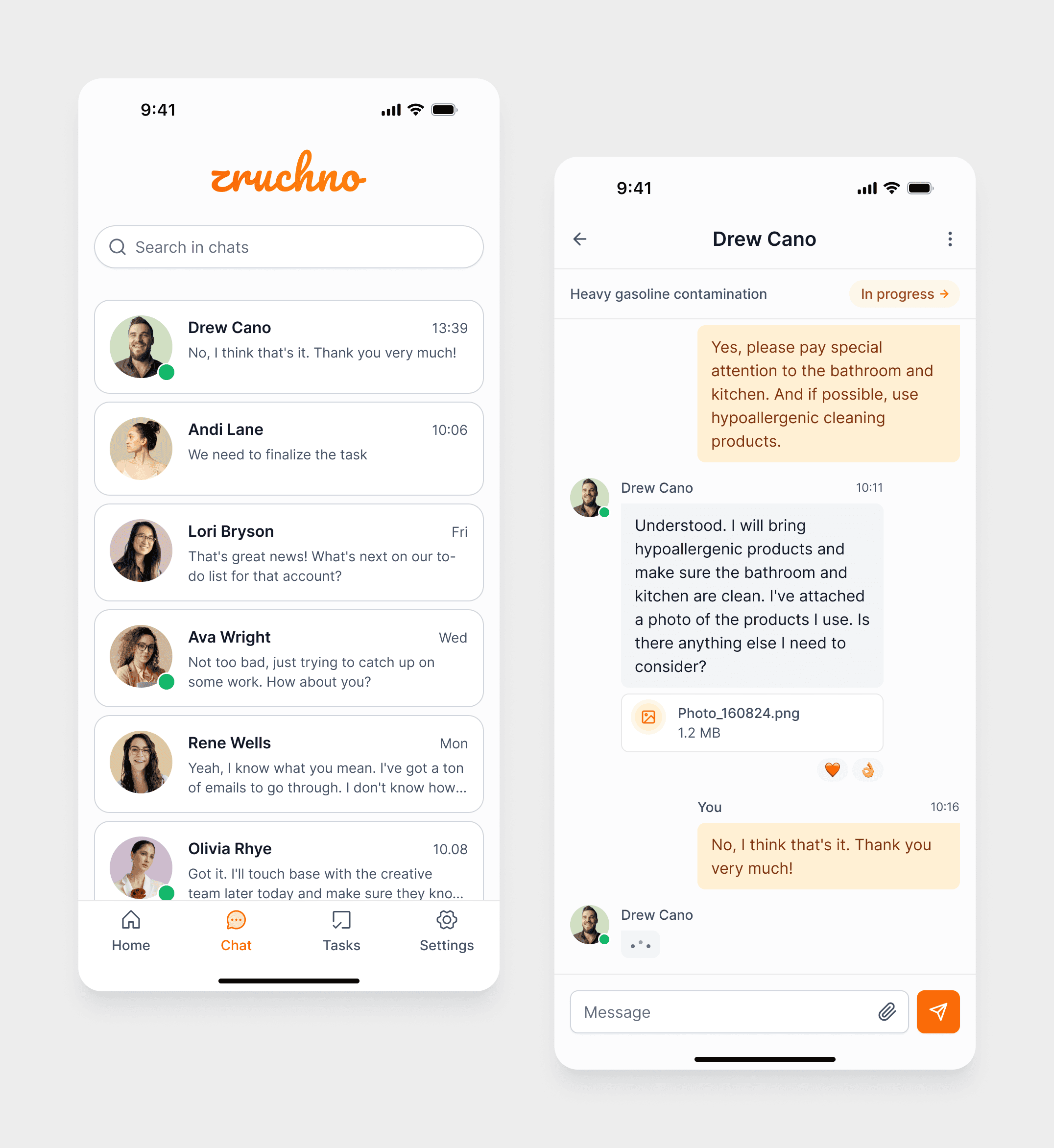
Users view contractor profiles with key reliability indicators (rating, reviews, badges, hourly rate) and can manage the list using filters and sorting.
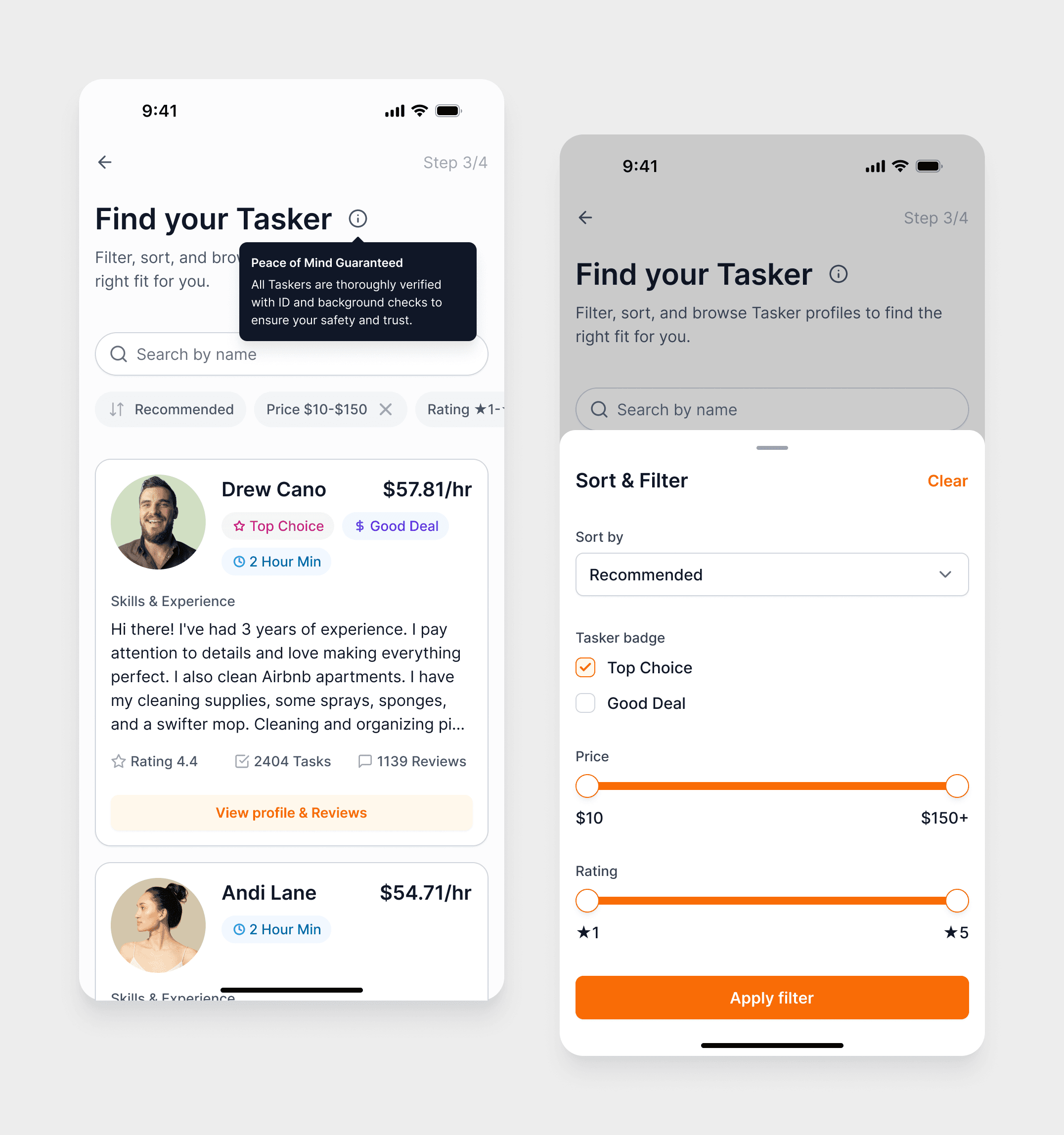
Tapping a card opens a modal with extended information: detailed description, full list of client reviews, additional experience details.
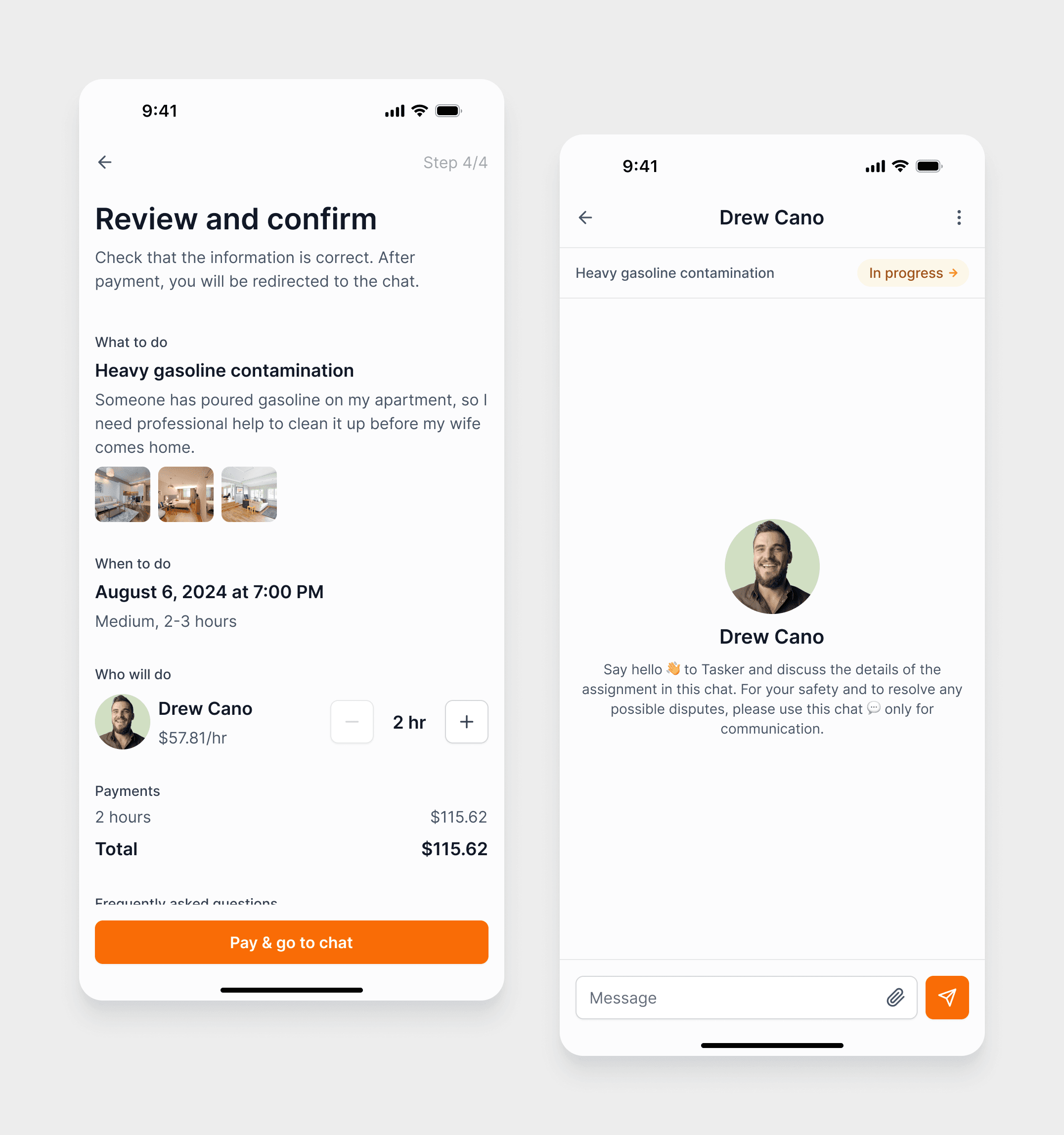
Step 4 – Review & confirmation
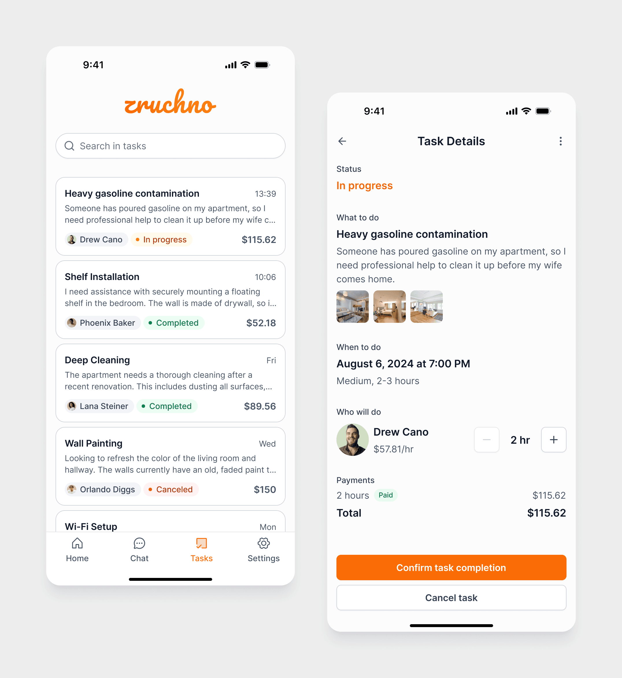
Before paying, users see a full summary of the task — details, scope, time, and chosen tasker — and then proceed to payment and chat.
Bottom navigation: supporting everyday use
To support not only the first‑time flow but also daily usage, I designed a bottom navigation bar with four main tabs:
Home
The main screen with search, category pills, and category cards — the starting point for creating new tasks.
Chat
Centralized access to all chats with taskers, linked to different tasks.
Tasks
A list of active and completed tasks created by the user, showing: task type and date, current status (pending, confirmed, in progress, completed), quick access to details and chat.
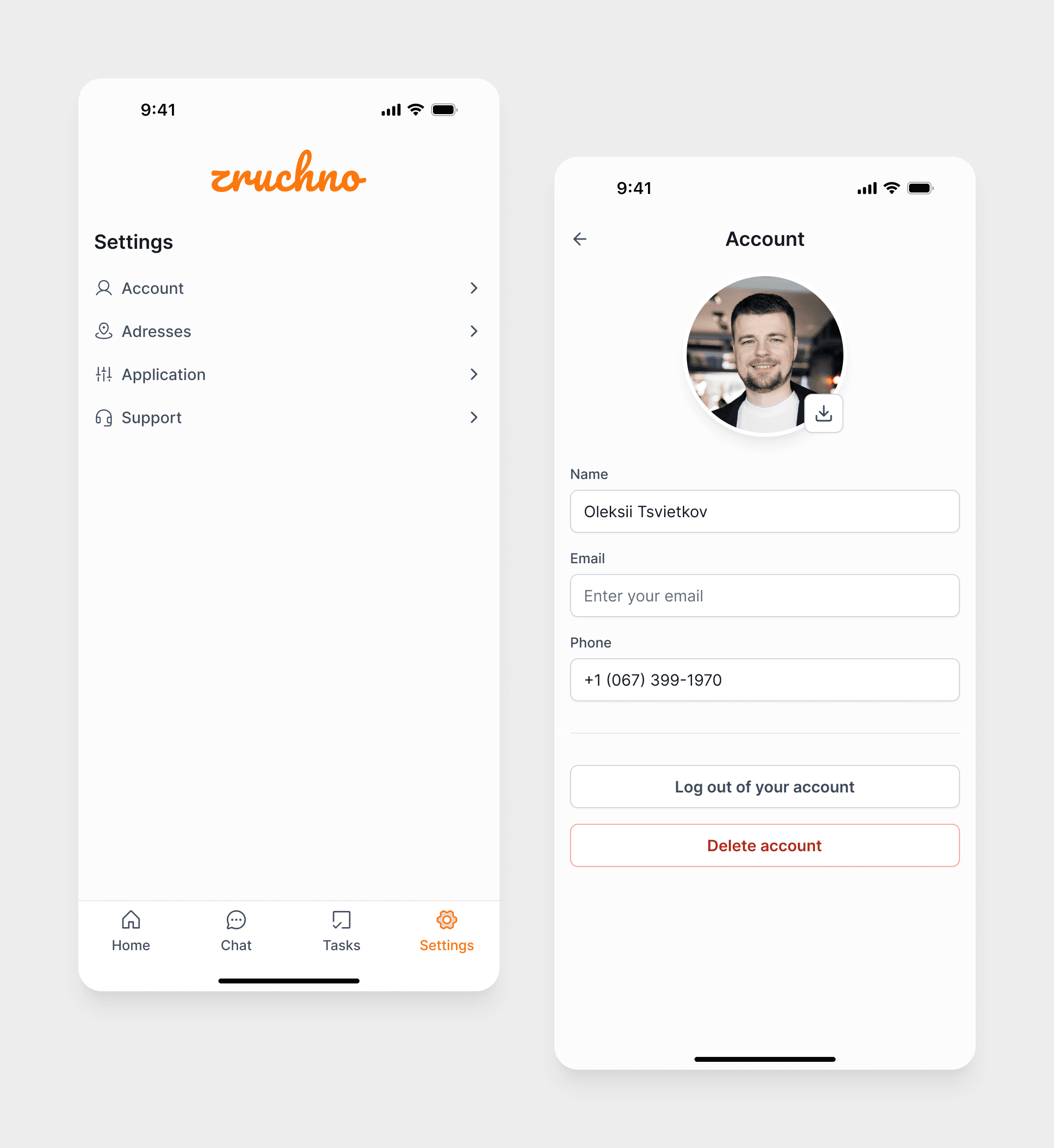
Settings
User profile management: personal information, saved addresses (add/remove), app information and interface language, contact options for support.
Design System
To save time, I opted for the “Untitled UI” design system. It included essential components that enabled quick customization, allowing me to focus on crafting a UX and UI solution that met the project’s needs. This also ensured consistency in style and high-quality visual elements while optimizing resources.


Outcome & Reflection
Zruchno was completed as a course pet project and did not go into production. However, it allowed me to go through a full UX cycle on my own — from research and interviews to information architecture, flows, and a complete mobile UI.
The project helped me deepen my experience in:
Structuring mobile flows for service marketplaces
Designing around trust and safety patterns
Balancing simplicity with enough detail for both users and taskers.